この記事について
見出しは、Webコンテンツにおいて重要な役割があります。見出しのデザインを工夫することで読者の興味を引いたり、情報を効率的に伝えることができます。
しかし、どのような見出しデザインを使えばいいのかわからないという方も多いのではないでしょうか。そこで今回は、現場で使える見出しパターン24選を用意しました。WordPressのブロックパターンとして簡単にコピー&ペーストできますので、ぜひご利用ください。
ペースト先のWordPressの環境は以下を想定しています。
- 最新のWordPressバージョン
- ブロックエディタの環境
- VK Blocksプラグイン
- 無料版の方でも使用できるように、CSSはカスタムHTMLブロックに書いてあります。カスタムHTMLブロックを削除するとCSSが消えてしまいますのでご注意ください。ペースト後のカスタムHTMLブロックのCSSは、追加CSSや小テーマのstyle.css、Pro版の方は「カスタムCSS」や「カスタムブロックスタイル設定」など、ご自身の管理しやすい場所に移動しておくと楽かなと思います。
- カスタムHTMLブロックに書かれたCSSは、管理画面上ではスタイルは適用されません。
- 各見出しデザインの下部にある「詳細を見る」をクリックしていただくと、「CSSの例」と「CSSプチ解説」が記載してありますので、カスタマイズされる方は、ぜひ一緒にご確認ください。
- 1. 中央見出し
- 1.1. 斜め線の中央見出し
- 1.2. 斜め線の中央見出し 02
- 1.3. 短い左右線 中央見出し
- 1.4. 縦下線 中央見出し
- 1.5. 短い上線 中央見出し
- 1.6. 短い下線 中央見出し
- 1.7. 背景斜め 中央見出し
- 1.8. 背景三角 中央見出し
- 1.9. サブタイトル背景斜め 中央見出し
- 1.10. サブタイトル背景三角 中央見出し
- 2. 数字と見出し
- 2.1. 数字の上に線 見出し
- 2.2. 数字の上に線 中央見出し
- 2.3. 数字の横に短い線 中央見出し
- 2.4. タイトルと重ねた数字 見出し
- 2.5. サブテキストと数字 見出し
- 3. 背景or枠あり見出し
- 3.1. 背景あり角斜め色付き
- 3.2. 背景あり角斜め
- 3.3. 背景をズラす
- 3.4. アイコンと見出し
- 4. シンプル見出し
- 4.1. 斜めストライプ
- 4.2. ストライプ
- 4.3. ドット下線
- 4.4. カギ括弧
- 4.5. 吹き出し風下線
- 5. VK Simple Copy Blockの紹介
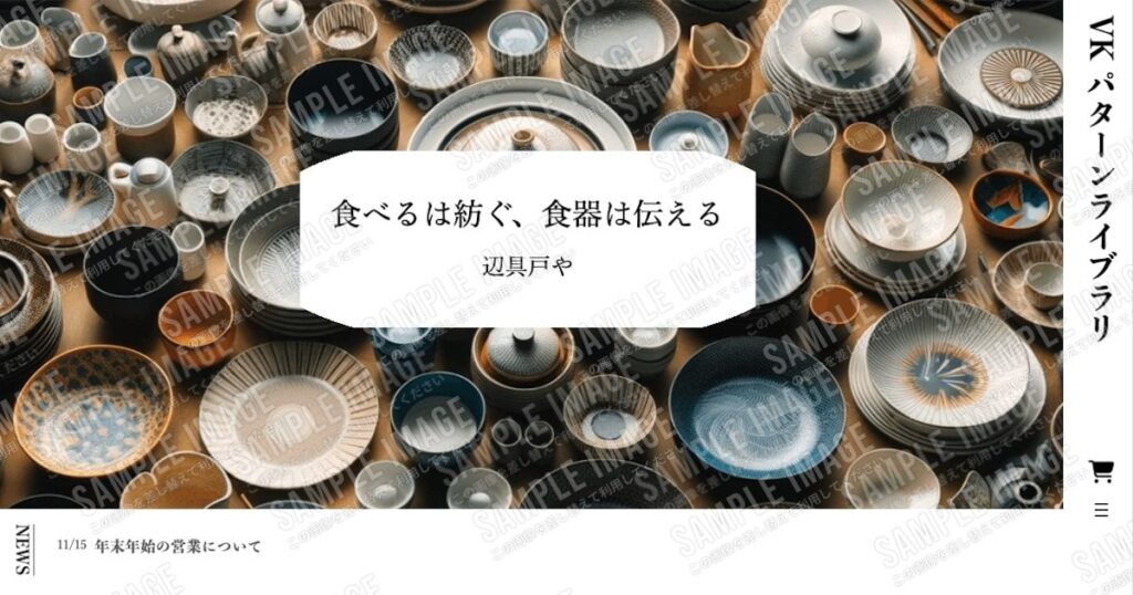
中央見出し
中央見出しは、ページの中心に配置されるため、自然と注目を集めることができます。そのため、重要なメッセージやセクションを強調する時に役立ちます。
斜め線の中央見出し
SUBTEXT
中央見出しデザイン
詳細を見る
CSSの例
/*中央寄せ*/
.is-style-vkp-heading-diagonal-line{
 display: flex;
 flex-wrap: nowrap;
 justify-content: center;
 align-items: center;
 border:0;
}
/*短い左右線*/
.is-style-vkp-heading-diagonal-line::before,
.is-style-vkp-heading-diagonal-line::after {
 content: '';
 width: 30px;
 height: 1px;
 background-color:currentColor !important;
 /*Lightning見出しデザイン設定のCSS対策*/
 position: unset;
 border: unset;
 margin-left: unset;
 margin-right:unset;
 flex-grow: unset;
}
.is-style-vkp-heading-diagonal-line::before{
 margin-right:14px;
 transform: rotate(60deg);
}
.is-style-vkp-heading-diagonal-line::after {
 margin-left:14px;
 transform: rotate(-60deg);
}CSSプチ解説
before、after要素で線を作成しています。transform:rotate() でbefore after要素の線の部分を回転させています。
線の部分の色を変えたい場合は background-color:currentColor; の「currentColor」に色指定してください。
斜め線の中央見出し 02
SUBTEXT
中央見出しデザイン
詳細を見る
CSSの例
/*中央寄せ*/
.is-style-vkp-heading-diagonal-line-02{
 display: flex;
 flex-wrap: nowrap;
 justify-content: center;
 align-items: center;
 border:0;
}
/*短い左右線*/
.is-style-vkp-heading-diagonal-line-02::before,
.is-style-vkp-heading-diagonal-line-02::after {
 content: '';
 width: 30px;
 height: 1px;
 background-color:currentColor !important;
 /*Lightning見出しデザイン設定のCSS対策*/
 position: unset;
 border: unset;
 margin-left: unset;
 margin-right:unset;
 flex-grow: unset;
}
.is-style-vkp-heading-diagonal-line-02::before{
 margin-right:14px;
 transform: rotate(-60deg);
}
.is-style-vkp-heading-diagonal-line-02::after {
 margin-left:14px;
 transform: rotate(-60deg);
}CSSプチ解説
before、after要素で線を作成しています。transform:rotate() でbefore after要素の線の部分を回転させていて、同じ方向に傾けています。
線の部分の色を変えたい場合は background-color:currentColor; の「currentColor」に色指定してください。
短い左右線 中央見出し
SUBTEXT
中央見出しデザイン
詳細を見る
CSSの例
/*中央寄せ*/
.is-style-vkp-heading-short_both_ends{
 display: flex;
 flex-wrap: nowrap;
 justify-content: center;
 align-items: center;
 border:0;
}
/*短い左右線*/
.is-style-vkp-heading-short_both_ends:before,
.is-style-vkp-heading-short_both_ends:after {
 content: '';
 width: 30px;
 height: 1px;
 background-color:currentColor !important;
 /*Lightning見出しデザイン設定のCSS対策*/
 position: unset;
 border: unset;
 margin-left: unset;
 margin-right:unset;
 flex-grow: unset;
}
.is-style-vkp-heading-short_both_ends:before{
 margin-right:14px;
}
.is-style-vkp-heading-short_both_ends:after {
 margin-left:14px;
}CSSプチ解説
before、after要素で線を作成しています。margin-leftとmargin-right で線とテキスト横に余白を開けています。
線の部分の色を変えたい場合は background-color:currentColor; の「currentColor」に色指定してください。
縦下線 中央見出し
SUBTEXT
中央見出しデザイン
詳細を見る
CSSの例
/*中央寄せ*/
.is-style-vkp-heading-vertical_bottomborder{
 position: relative;
 display: flex;
 justify-content: center;
 align-items: center;
 flex-direction : column;
 margin-bottom: 2em;
}
/*縦下線*/
.is-style-vkp-heading-vertical_bottomborder::before{
 content: '';
 position: absolute;
 display: inline-block;
 width: 1px;
 height: 20px;
 bottom: -30px;
 left: 50%;
 -webkit-transform: translateX(-50%);
 transform: translateX(-50%);
 background-color:currentColor !important;
 /*Lightning見出しデザイン設定のCSS対策*/
 top:unset;
 border: unset;
 margin-left: unset;
 margin-right:unset;
}CSSプチ解説
before要素で線を作成しています。absoluteで絶対配置にしてleftとtranslateX()で中央に配置しています。
線の部分の色を変えたい場合は background-color:currentColor; の「currentColor」に色指定してください。
短い上線 中央見出し
中央見出しデザイン
SUBTEXT
詳細を見る
CSSの例
/*上線*/
.is-style-vkp-heading-short-top-border::before{
 content: '';
 position: relative;
 display: block;
 width: 3rem;
 height: 1px;
 margin-bottom: 1.5rem;
 background-color:currentColor !important;
 /*Lightning見出しデザイン設定のCSS対策*/
 border: unset;
 top:unset;
 left:unset;
 bottom:unset;
}

/*中央寄せ*/
.is-style-vkp-heading-short-top-border.vkp-center::before{
 margin-left: auto;
 margin-right: auto;
}CSSプチ解説
before要素で上線を作成しています。
線の部分の中央寄席せは margin-left: auto; margin-right: auto; で中央にしています。
線の部分の色を変えたい場合は background-color:currentColor; の「currentColor」に色指定してください。
短い下線 中央見出し
SUBTEXT
中央見出しデザイン
詳細を見る
CSSの例
/*下線*/
.is-style-vkp-heading-short-bottom-border::after{
 content: '';
 position: relative;
 display: block;
 width: 3rem;
 height: 1px;
 margin-top: 1.5rem;
 background-color:currentColor !important;
 /*Lightning見出しデザイン設定のCSS対策*/
 border: unset;
 top:unset;
 left:unset;
 bottom:unset;
}

/*中央寄せ*/
.is-style-vkp-heading-short-bottom-border.vkp-center::after{
 margin-left: auto;
 margin-right: auto;
}CSSプチ解説
after要素で下線を作成しています。
線の部分の中央寄席せは margin-left: auto; margin-right: auto; で中央にしています。
線の部分の色を変えたい場合は background-color:currentColor; の「currentColor」に色指定してください。
背景斜め 中央見出し
中央見出しデザイン
SUBTEXT
詳細を見る
CSSの例
/*外側 中央寄せ*/
.heading-center-outer{
 display: flex;
 justify-content: center;
}
/*背景部分*/
.is-style-vkp-heading-diagonal-bg{
 position: relative;
 display: inline-block;
 height: 58px;
}
/*左右の斜め部分*/
.is-style-vkp-heading-diagonal-bg::before,
.is-style-vkp-heading-diagonal-bg::after{
 content: '';
 position: absolute;
 width: 0px;
 height: 0px;
 top: 0px;
}
/*左の斜め部分*/
.is-style-vkp-heading-diagonal-bg::before{
 border-bottom: 58px solid transparent;
 border-left: 20px solid var(--wp--preset--color--black);
 right: -20px;
}
/*右の斜め部分*/
.is-style-vkp-heading-diagonal-bg::after{
 border-top: 58px solid transparent;
 border-right: 20px solid var(--wp--preset--color--black);
 left: -20px;
}CSSプチ解説
背景色、パディング(内側の余白)は見出しのスタイル設定から設定しています。before、after要素で左右の斜め部分を作成しています。
背景色を変える場合は、見出しのスタイル設定の背景から色を変えてbefore、after要素のborderの色を変更してください。
背景三角 中央見出し
中央見出しデザイン
SUBTEXT
詳細を見る
CSSの例
/*外側 中央寄せ*/
.heading-center-outer{
 display: flex;
 justify-content: center;
}
/*背景部分*/
.is-style-vkp-heading-triangle-bg{
 position: relative;
 display: inline-block;
 height: 58px;
}
/*左右の三角部分*/
.is-style-vkp-heading-triangle-bg::before,
.is-style-vkp-heading-triangle-bg::after{
 content: '';
 position: absolute;
 width: 0px;
 height: 0px;
 top: 0px;
 /*Lightning見出しデザイン設定のCSS対策*/
 border: unset;
}
/*右の三角部分*/
.is-style-vkp-heading-triangle-bg::after{
 border-top: 29px solid transparent;
 border-bottom: 29px solid transparent;
 border-left: 20px solid #000;
 position: absolute;
 right: -20px;
 /*Lightning見出しデザイン設定のCSS対策*/
 left:unset;
}
/*左の三角部分*/
.is-style-vkp-heading-triangle-bg::before{
 border-top: 29px solid transparent;
 border-bottom: 29px solid transparent;
 border-right: 20px solid #000;
 position: absolute;
 left: -20px;
 /*Lightning見出しデザイン設定のCSS対策*/
 right:unset;
}CSSプチ解説
背景色、パディング(内側の余白)は見出しのスタイル設定から設定しています。before、after要素で左右の三角部分を作成しています。
背景色を変える場合は、見出しのスタイル設定の背景から色を変えてbefore、after要素のborderの色を変更してください。
サブタイトル背景斜め 中央見出し
中央見出しデザイン
SUBTEXT
詳細を見る
CSSの例
/*外側 中央寄せ*/
.heading-center-outer{
 display: flex;
 justify-content: center;
}
/*背景部分*/
.is-style-vkp-subtitle-diagonal-bg{
 position: relative;
 display: inline-block;
 height: 38px;
}
/*左右の斜め部分*/
.is-style-vkp-subtitle-diagonal-bg::before,
.is-style-vkp-subtitle-diagonal-bg::after{
 content: '';
 width: 0px;
 height: 0px;
 top: 0px;
 position: absolute;
}
/*左の斜め部分*/
.is-style-vkp-subtitle-diagonal-bg::before{
 border-bottom: 38px solid transparent;
 border-left: 20px solid var(--wp--preset--color--black);
 right: -20px;
}
/*右の斜め部分*/
.is-style-vkp-subtitle-diagonal-bg::after{
 border-top: 38px solid transparent;
 border-right: 20px solid var(--wp--preset--color--black);
 left: -20px;
}CSSプチ解説
背景色、パディング(内側の余白)は段落のスタイル設定から設定しています。before、after要素で左右の斜め部分を作成しています。
背景色を変える場合は、段落のスタイル設定の背景から色を変えてbefore、after要素のborderの色を変更してください。
サブタイトル背景三角 中央見出し
中央見出しデザイン
SUBTEXT
詳細を見る
CSSの例
/*外側 中央寄せ*/
.heading-center-outer{
 display: flex;
 justify-content: center;
}
/*背景部分*/
.is-style-vkp-subtitle-triangle-bg{
 position: relative;
 display: inline-block;
 height: 38px;
}
/*左右の三角部分*/
.is-style-vkp-subtitle-triangle-bg::before,
.is-style-vkp-subtitle-triangle-bg::after{
 content: '';
 position: absolute;
 width: 0px;
 height: 0px;
 top: 0px;
}
/*左の三角部分*/
.is-style-vkp-subtitle-triangle-bg::before{
 border-top: 19px solid transparent;
 border-bottom: 19px solid transparent;
 border-right: 10px solid var(--wp--preset--color--black);
 position: absolute;
 left: -10px;
}
/*右の三角部分*/
.is-style-vkp-subtitle-triangle-bg::after{
 border-top: 19px solid transparent;
 border-bottom: 19px solid transparent;
 border-left: 10px solid var(--wp--preset--color--black);
 position: absolute;
 right: -10px;
}CSSプチ解説
背景色、パディング(内側の余白)は段落のスタイル設定から設定しています。before、after要素で左右の斜め部分を作成しています。
背景色を変える場合は、段落のスタイル設定の背景から色を変えてbefore、after要素のborderの色を変更してください。
数字と見出し
数字を使うことで情報に順序が付けられ、読みやすさが向上します。プロセスの説明や段階的な手順、ポイントの説明などの情報を表示する際に役立ちます。
数字の上に線 見出し
01
数字と見出しデザイン
詳細を見る
CSSの例
/*数字*/
.is-style-vkp-num{
 font-family: "Arial", "メイリオ";
}
/*上線*/
.is-style-vkp-num-heading-short-top-border::before{
 content: '';
 position: relative;
 display: block;
 width: 3rem;
 height: 1px;
 background-color:currentColor;
}CSSプチ解説
before要素で上線を作成しています。
線の部分の色を変えたい場合は background-color:currentColor; の「currentColor」に色指定してください。
数字の上に線 中央見出し
01
数字と見出しデザイン
詳細を見る
CSSの例
/*数字*/
.is-style-vkp-num{
 font-family: "Arial", "メイリオ";
}
/*上線*/
.is-style-vkp-num-heading-short-top-border::before{
 content: '';
 position: relative;
 display: block;
 width: 3rem;
 height: 1px;
 background-color:currentColor;
}
/*中央寄せ*/
.is-style-vkp-num-heading-short-top-border.vkp-center::before{
 margin-left: auto;
 margin-right: auto;
}CSSプチ解説
before要素で上線を作成しています。
線の部分の中央寄席せは margin-left: auto; margin-right: auto; で中央にしています。
線の部分の色を変えたい場合は background-color:currentColor; の「currentColor」に色指定してください。
数字の横に短い線 中央見出し
01
数字と見出しデザイン
詳細を見る
CSSの例
/*数字*/
.is-style-vkp-num{
 font-family: "Arial", "メイリオ";
}
/*中央寄せ*/
.is-style-vkp-heading-short_both_ends{
 display: flex;
 flex-wrap: no-wrap;
 justify-content: center;
 align-items: center;
 border:0;
}
/*短い左右線*/
.is-style-vkp-heading-short_both_ends:before,
.is-style-vkp-heading-short_both_ends:after {
 content: '';
 width: 30px;
 height: 1px;
 background-color:currentColor;
}
.is-style-vkp-heading-short_both_ends:before{
 margin-right:14px;
}
.is-style-vkp-heading-short_both_ends:after {
 margin-left:14px;
}CSSプチ解説
before、after要素で線を作成しています。margin-leftとmargin-right で線に余白を開けています。
線の部分の色を変えたい場合は background-color:currentColor; の「currentColor」に色指定してください。
短い左右線 中央見出しと同じCSSで左右線をつけています。
タイトルと重ねた数字 見出し
数字と見出しデザイン
詳細を見る
CSSの例
.is-style-vkp-heading-overlap{
 position: relative;
 z-index:1;
}
/*背景の数字部分*/
.is-style-vkp-heading-overlap::before {
 content: '01';
 position: absolute;
 /*上下中央寄せ*/
 top: 50%;
 left: 50%;
 transform: translateY(-50%) translateX(-50%);
 -webkit- transform: translateY(-50%) translateX(-50%);
 color: rgba(0,0,0,0.1);
 font-size: 5rem;
 z-index: -1;
}CSSプチ解説
before要素で背景の数字部分を作成しています。
数字部分の文字を変更する場合はcontent: '01';の01部分を変更してください。
数字部分の色を変えたい場合はcolor: rgba(0,0,0,0.1);のrgba(0,0,0,0.1)部分にお好みの色コードを入れてください。
サブテキストと数字 見出し
POINT
01
数字と見出しデザイン
詳細を見る
CSSの例
/*数字とサブテキスト*/
.is-style-vkp-num{
 font-family: "Arial", "メイリオ";
}CSSプチ解説
サブテキストと数字の部分のみ、font-familyをつけています。
背景or枠あり見出し
背景や枠がある見出しは、テキストを強調しやすくなります。読者の注意を引きつけることができ、重要なポイントやセクションを目立たせる効果があります。
また、企業のブランドカラーを背景色として使用すると、ブランディング効果を高めることもできます。
背景あり角斜め色付き
背景あり見出しデザイン
詳細を見る
CSSの例
/*見出し部分*/
.is-style-vkp-heading-diagonal-triangle{
 position:relative;
 z-index:1;
}
/*背景の装飾*/
.is-style-vkp-heading-diagonal-triangle::before{
 content: '';
 position: absolute;
 z-index:-1;
 top: 0px;
 bottom: 0px;
 left: 0px;
 right: 0px;
 background-image: linear-gradient(135deg, #000 15px, transparent 15px calc(100% - 15px), #000 calc(100% - 15px));
 /*Lightning見出しデザイン設定のCSS対策*/
 border: unset;
 margin: unset;
 width: unset;
 height: unset;
}CSSプチ解説
linear-gradientで135度傾けて三角部分の黒( #000 )と透明( transparent )のグラデーションを作成しています。
黒と透明に同じ色経由地点の15px を入れて角斜めの模様を作成しています。
透明にcalc(100% - 15px)で幅いっぱいの100%から15pxを引いた場所を終了地点、右下の黒の開始点をcalc(100% - 15px)として右下黒を作成しています。
背景色のグレーは見出しのスタイル設定から設定していますので、色を変更するときはスタイル設定から変更してください。
背景あり角斜め
背景あり見出しデザイン
詳細を見る
CSSの例
/*見出し部分*/
.is-style-vkp-heading-diagonal-triangle-wh{
 position:relative;
 z-index:1;
}
/*背景の装飾*/
.is-style-vkp-heading-diagonal-triangle-wh::before{
 content: '';
 z-index:-1;
 position: absolute;
 top: 0px;
 bottom: 0px;
 left: 0px;
 right: 0px;
 background-image: linear-gradient(135deg, #fff 15px, transparent 15px calc(100% - 15px), #fff calc(100% - 15px));
 /*Lightning見出しデザイン設定のCSS対策*/
 border: unset;
 margin: unset;
 width: unset;
 height: unset;
}CSSプチ解説
linear-gradient() で135度傾けて三角部分の白( #fff )と透明( transparent )のグラデーションを作成して角が欠けているように表現しています。
白と透明に同じ色経由地点の15px を入れて角斜めの模様を作成しています。
透明にcalc(100% - 15px)で幅いっぱいの100%から15pxを引いた場所を終了地点、右下の黒の開始点をcalc(100% - 15px)として右下黒を作成しています。
背景色のグレーは見出しのスタイル設定から設定していますので、色を変更するときはスタイル設定から変更してください。
背景をズラす
背景あり見出しデザイン
詳細を見る
CSSの例
/*見出し部分*/
.is-style-vkp-heading-shift-bg{
 position:relative;
}
/*ズラす線の部分*/
.is-style-vkp-heading-shift-bg::before{
 content: '';
 position: absolute;
 top: -5px;
 left: -5px;
 width: 100%;
 height: 100%;
 border: 1px solid currentColor !important;
 /*Lightning見出しデザイン設定のCSS対策*/
 margin: unset;
}CSSプチ解説
before要素で囲み線を作成しています。
囲み線をposition: absolute; でtop と left を-5px ズラしてズレているように表現しています。
囲み線の部分の色を変えたい場合は border: 1px solid currentColor; の「currentColor」に色指定してください。
背景色のグレーは見出しのスタイル設定から設定していますので、色を変更するときはスタイル設定から変更してください。
アイコンと見出し
背景あり見出しデザイン
Font Awesomeアイコンを使用していますので、Lightningテーマ、もしくはVK Blocksプラグイン、もしくはExUnitプラグインのいずれかが必要です。
詳細を見る
CSSの例
/*リボンの背景色*/
:root {
  --ribbon-bg-color:#currentColor;
}
/*横並びブロック部分*/
.is-style-vkp-ribbon{
 position:relative;
}
/*アイコン部分*/
.is-style-vkp-ribbon .vk_icon{
 display: inline-block;
 position: absolute;
 top: 0;
 left: 10px;
 margin: 0;
 padding-left:0;
 padding-right:0;
 z-index: 1;
 width: 50px;
 background:var(--ribbon-bg-color);
 text-align: center;
}
/*アイコンのリボン部分*/
.is-style-vkp-ribbon .vk_icon::before{
 content: '';
 position: absolute;
 left: 0;
 top: 100%;
 height: 0;
 width: 0;
 border-left: 25px solid var(--ribbon-bg-color);
 border-right: 25px solid var(--ribbon-bg-color);
 border-bottom: 10px solid transparent;
}
.is-style-vkp-ribbon .is-style-vk-heading-plain{
 padding:0.75rem 0.75rem 0.75rem 80px;
}CSSプチ解説
before要素でリボンの装飾を作成しています。
リボンの背景色はCSS変数にしてまとめていますので、色を変えたい場合は --ribbon-bg-color:currentColor; の「currentColor」に色指定してください。
枠線は横並びブロックのスタイル設定から設定していますので、色などを変更するときはブロックのスタイル設定から変更してください。(Lightningテーマの場合は、外観 > カスタマイズ > Lightning 機能設定 の theme.json が有効になっていることで変更できます。)
theme.jsonについて
- 新規に作成するサイトであれば有効化が推奨です。
- ただし、既存サイトで後から有効にするとグループブロックなど一部 html 構造が変更されますので、新規サイト以外で有効化する場合は表示検証を十分に行ってください。
シンプル見出し
シンプルな見出しは、さまざまなスタイルやデザインに適応しやすく汎用性が高いので、ブログやWEBコンテンツなど幅広い用途で活用できます。
斜めストライプ
シンプル見出しデザイン
詳細を見る
CSSの例
/*見出し部分*/
.is-style-vkp-heading-diagonal-stripe-line{
 position:relative;
 padding-bottom:1rem;
}
/*斜めストライプ部分*/
.is-style-vkp-heading-diagonal-stripe-line::before{
 position: absolute;
 content: '';
 left: 0;
 bottom: 0;
 width: 100%;
 height: 8px;
 background-image:repeating-linear-gradient(
  -45deg, #000, #000 1px, transparent 1px, transparent 5px
 );
 background-size:7px 7px;
 -webkit-background-size:7px 7px;
 /*Lightning見出しデザイン設定のCSS対策*/
 border:none;
 top:unset;
}CSSプチ解説
repeating-linear-gradient()で-45度傾けて開始色( #000 )、開始色( #000 )と終了地点(1px)、2色目の透明( transparent )と開始地点(1px)、透明( transparent )と終了地点(5px) で斜めストライプ部分を表現しています。
ストライプの色を変える場合は開始色( #000 )に色指定してください。
ストライプ
シンプル見出しデザイン
詳細を見る
CSSの例
/*見出し部分*/
.is-style-vkp-heading-stripe-line{
 position:relative;
 padding-bottom:1rem;
}
/*縦ストライプ*/
.is-style-vkp-heading-stripe-line::before{
 position: absolute;
 content: '';
 left: 0;
 bottom: 0;
 width: 100%;
 height: 8px;
 background-image:repeating-linear-gradient(
 90deg, #000, #000 1px, transparent 1px, transparent 6px);
 /*Lightning見出しデザイン設定のCSS対策*/
 border:none;
 top:unset;
}CSSプチ解説
repeating-linear-gradient()で90度で直角にして、開始色( #000 )、開始色( #000 )と終了地点(1px)、2色目の透明( transparent )と開始地点(1px)、透明( transparent )と終了地点(6px) で縦ストライプ部分を表現しています。
ストライプの色を変える場合は開始色( #000 )に色指定してください。
ドット下線
シンプル見出しデザイン
詳細を見る
CSSの例
.is-style-vkp-heading-dotted-line{
 position:relative;
 padding-bottom:0.5rem;
 border-bottom: 5px dotted currentColor;
}CSSプチ解説
borderのスタイルの dotted でドット線にしています。ドットの色を変えたい場合はcurrentColor に色指定してください。
カギ括弧
シンプル見出しデザイン
詳細を見る
CSSの例
/*見出し部分*/
.is-style-vkp-heading-bracket{
 position: relative;
 padding:0.5em 1em;
}
/*カギ括弧 共通*/
.is-style-vkp-heading-bracket::before,
.is-style-vkp-heading-bracket::after {
 position: absolute;
 content:'';
 width: 1rem;
 height: 2rem;
 /*Lightning見出しデザイン設定のCSS対策*/
 background: unset;
}
/*左のカギ括弧*/
.is-style-vkp-heading-bracket::before {
 border-left: solid 1px currentColor;
 border-top: solid 1px currentColor;
 top:0;
 left: 0;
 /*Lightning見出しデザイン設定のCSS対策*/
 border-right: unset;
 border-bottom: unset;
}
/*右のカギ括弧*/
.is-style-vkp-heading-bracket::after {
 border-right: solid 1px currentColor;
 border-bottom: solid 1px currentColor;
 bottom:0;
 right: 0;
 /*Lightning見出しデザイン設定のCSS対策*/
 border-left: unset;
 border-top: unset;
 margin-right: unset;
 left:unset;
}CSSプチ解説
before、after要素でカギ括弧を作成しています。
括弧の部分の色を変えたい場合は before、after要素に指定してあるborder の色部分の「currentColor」に色指定してください。
吹き出し風下線
シンプル見出しデザイン
詳細を見る
CSSの例
/*見出し部分*/
.is-style-vkp-heading-speech-balloon-under-line{
 position:relative;
 padding-bottom:0.5rem;
 border-bottom:1px solid currentColor;
}
/*吹き出し部分*/
.is-style-vkp-heading-speech-balloon-under-line::before{
 content:'';
 position: absolute;
 top: 100%;
 left: 50%;
 transform: translateX(-50%) skew(-25deg);
 height: 15px;
 width: 15px;
 border-right: 1px solid currentColor;
 background-color: #fff !important;
 /*Lightning見出しデザイン設定のCSS対策*/
 border-left: none;
 border-top: unset;
 border-bottom: unset;
}CSSプチ解説
left:50%と transform のtranslateX(-50%) で中央に寄せ、skew(-25deg) で25度傾け、吹き出し部分を作成しています。
吹き出し部分の色を変えたい場合は borderに指定してある「currentColor」に色指定してください。
VK Simple Copy Blockの紹介
この記事のブロックパターンコピー機能は「VK Simple Copy Block」を使用して作成しました。ぜひブロックパターン集を作成の際にご利用ください。
この記事を書いた人
-
デザインやCSSコーディング、フォーラム対応を担当しています。フォーラムでは「うなこ」という名前で投稿しています。
WordFes Nagoya(2013-2017)では、名古屋版わぷーを制作しました。
最近の投稿


を購入して
特典をゲットしよう!

特典A
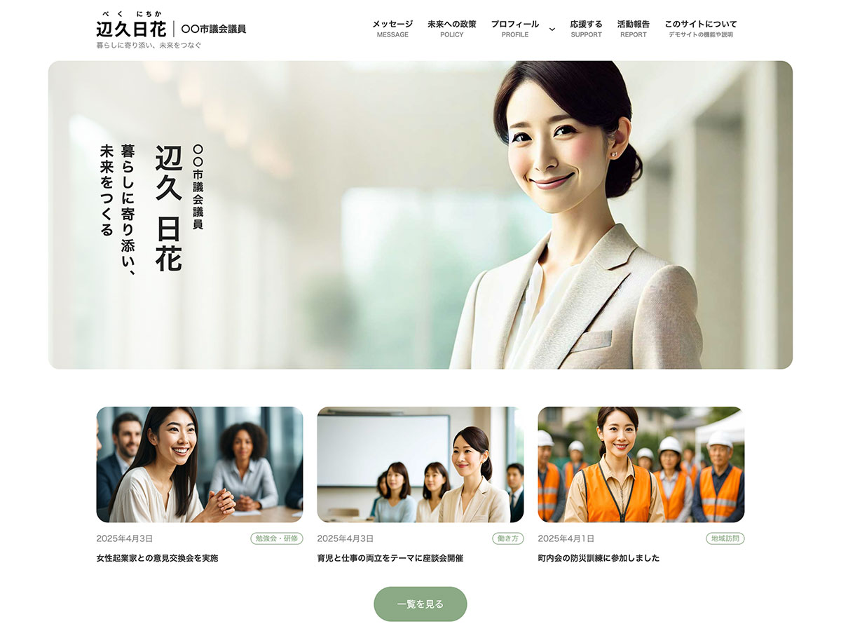
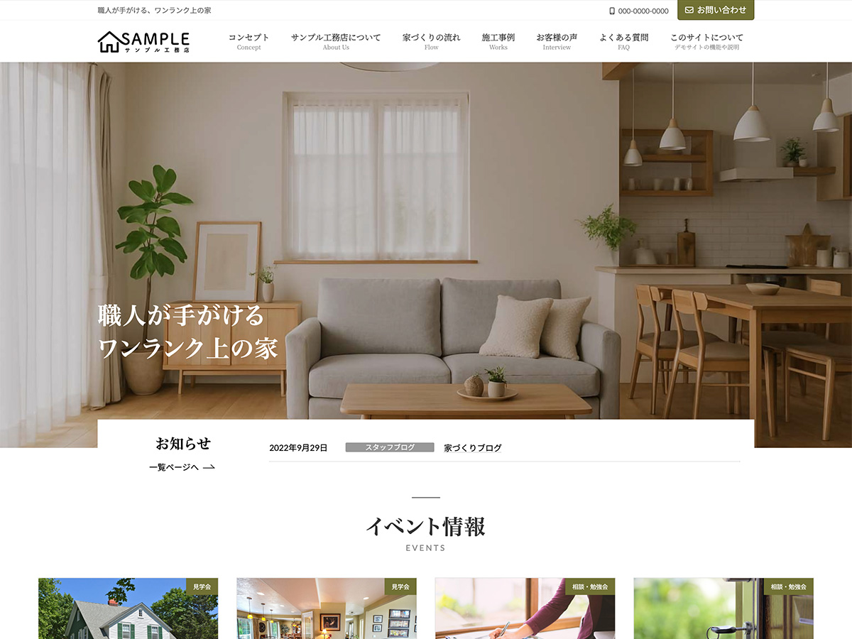
X-T9 工務店
( ナチュラル )
19,800円(税込)
0円に!
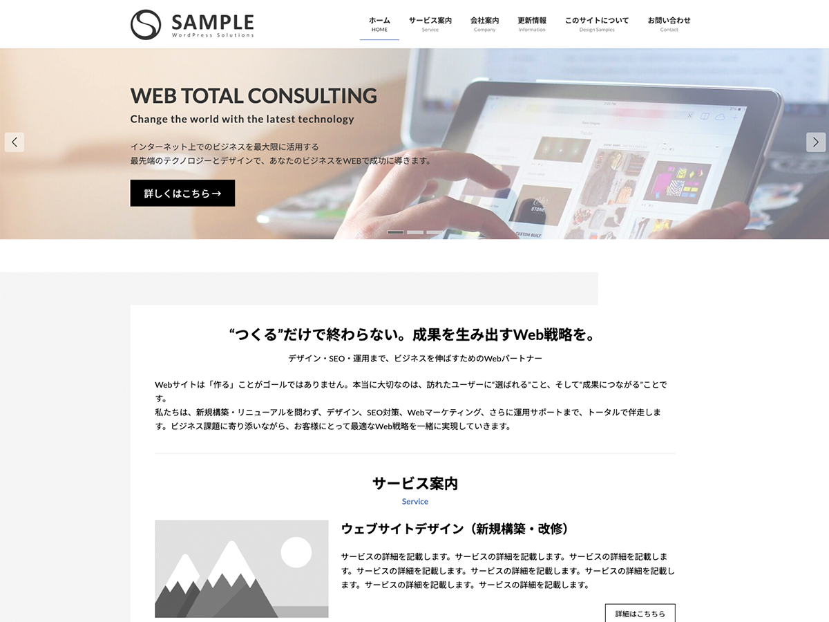
特典B
Lightning ビジネス(Evergreen)
9,900円(税込)
0円に!
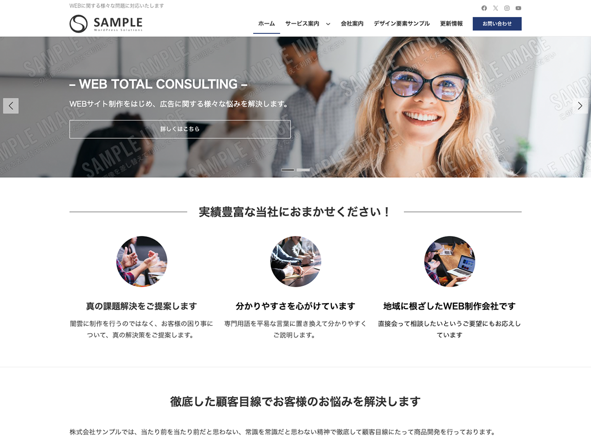
特典C
Lightning 工務店
( ナチュラル )
19,800円(税込)
0円に!
今なら!
Vektor Passport の
有効期間中、上記の
デモサイトデータを
何度でも素早くまるごと
インポートできます!
爆速!!1分でデモサイトと同じ
ホームページができる
選んだデモサイトと同じ状態の WordPress サイトを、わずか数ステップで再現できるインポート専用プラグインです。数クリックで、プロ品質のサイトがすぐに起動します。
フルサイト編集対応ブロックテーマ
WordPress テーマ X-T9 は、WordPress 5.9 から実装されたフルサイト編集機能に対応した「ブロックテーマ」と呼ばれる新しい形式のテーマです。
ヘッダーやフッターなど、今までのテーマではカスタマイズが難しかったエリアもノーコードで簡単・柔軟にカスタマイズする事ができます。
パターンを使って
よりクオリティの高いサイトに
パターンとは、WordPressのブロックを組み合わせて作ったデザインテンプレートのようなもの。プロのデザイナーが制作したパターンを300以上公開中!コピペしながら高品質なサイトを簡単に作れます。
ブロックエディターで
ABテストを
自由に作成できる

VK AB Testing は、ABテストを実施するための WordPress 用プラグインです。ブロックエディターでテストパターンを自由に作成でき、ランダム表示とクリック計測が可能です。Webサイトや広告などの施策の改善にぜひご活用ください。